The University of Rochester has introduced a new brand identity as it faces both financial pressures and an ambitious fundraising campaign.
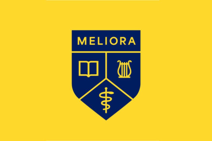
The most obvious change includes a redesigned logo that introduces “URochester” as the branded shorthand for the university. The overhaul also includes a redesigned Meliora shield, modern typography, and a revised color palette.

The rebrand comes at a pivotal moment for the institution. Federal cuts to research grants have cost the university millions of dollars, and anticipated reductions to Medicaid reimbursements could further stress the finances of its medical centers. Long-term changes to student aid programs have also raised concerns about affordability for future students, at a time when higher education institutions are anticipating declining enrollment across the US.
Concurrent with this rebrand, the University of Rochester also launched its largest fundraising effort in its history. The “For Ever Better” campaign, announced in September, seeks to raise $1.75 billion to support research, faculty positions, scholarships, and health care initiatives.

According to the university, the rebrand follows two years of research and feedback from students, faculty, staff, alumni, and patients.
Response on social media, though, indicates many alumni and current students are unhappy with the redesign. On Instagram, hundreds of users responded to the announcement, questioning why the university would invest in a new logo during a period of financial strain. Many pointed to the design’s simplicity and minimalism, calling it “corporate,” “generic,” or even “soulless.”
In a statement, University Spokesperson Sara Miller said, "A revitalized brand is about clarifying our identity so more people see our value, feel our impact, and choose to be part of what comes next."
In response to questions about social media response, she said, "We have taken a very thorough approach and there is a lot of support for it as well and many who want to use it and are excited that we are helping to elevate the reputation. We are grateful to our many community members who care so much about the University and there is a lot of excitement about the brand launch with members of the University community."
According to the university's announcement, the changes are meant to improve digital accessibility and unify the institution’s image. The logo is just one facet of the brand overhaul, which also includes a new brand promise: Ever wonder. Ever better.


